 |
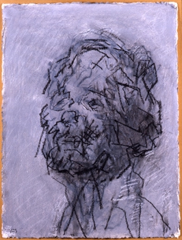
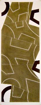
| David Tremlett - http://www.sandrageringinc.com/exhibitions/2004-05-01_david-tremlett-drawing/#/images/3/ |
 |
| David Tremlett - http://www.sandrageringinc.com/exhibitions/2004-05-01_david-tremlett-drawing/#/images/5/ |
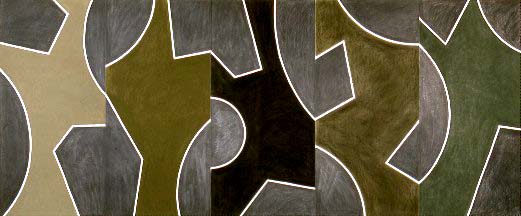 |
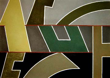
| David Tremlett - http://www.sandrageringinc.com/exhibitions/2004-05-01_david-tremlett-drawing/#/images/2/ I really like how the artist uses white outlines to distinct different shapes within the design. The shapes don't even link together in any way, he uses a range of different colours but they tend to be a dark vibe, most of his work contain dark colours. The shapes are so random but it works, at it looks good, and catches attention especially due to the bold white boarders. I really like the effect the white outlines have, really makes the image stand out and the shapes stand out better as a single shape even though combined with many others. |