 |
| Claude Monet - http://www.sherrydramsey.com/?p=767 Here is a combination of colour, even though the colour red is at the back of the image, and the is a slight blue colour at the top, it gives the illusion the blue is still further behind, as blue tends to go back in compression to red that comes foreword to the human eyes first. Very bright piece of work, the detail is so beautiful created too. |
Thursday, 6 November 2014
Colour
Tuesday, 4 November 2014
Colour
 |
| Claude Monet - http://www.aliexpress.com/item-img/Monet-Field-of-Poppies-II-famous-hand-made-Oil-Paintings-Reproduction-On-Canvas-Landscape-handpaint-oil/563645092.html Here is an image thats using colour to create space; having the red flower in the foreground brings them to the front, as our eyes automatically put this colour first its not necassarly because it's bright a bright colour. Then to have the background a blue colour what's a a lot cooler colour, gives it so a further a field is present in the image giving it a sense of distance. |
Colour
 |
| Marta Marcé - http://martamarce.com |
 |
| Marta Marcé - http://martamarce.com |
 |
| Marta Marcé - http://martamarce.com |
 |
| Marta Marcé - http://martamarce.com |
 |
| Marta Marcé - http://martamarce.com |
 |
| Marta Marcé - http://martamarce.com |
\
 |
| Marta Marcé - http://martamarce.com |
 |
| Marta Marcé - http://martamarce.com |
 |
| Marta Marcé - http://martamarce.com |
 |
| Marta Marcé - http://martamarce.com |
 |
| Marta Marcé - http://martamarce.com |
 |
| Marta Marcé - http://martamarce.com |
 |
| Marta Marcé - http://martamarce.com |
 |
| Marta Marcé - http://martamarce.com |
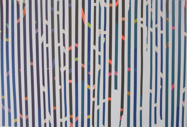
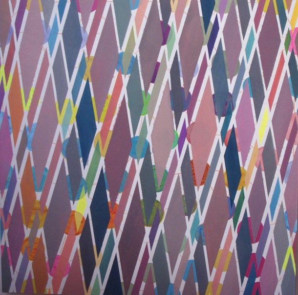
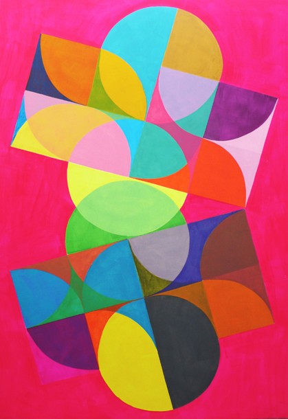
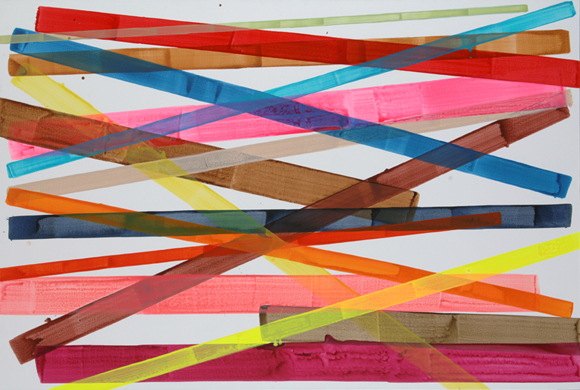
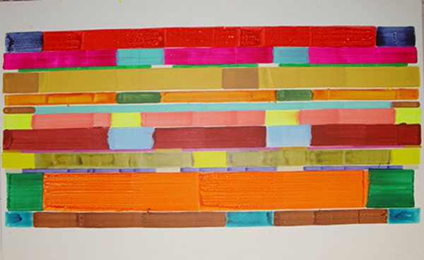
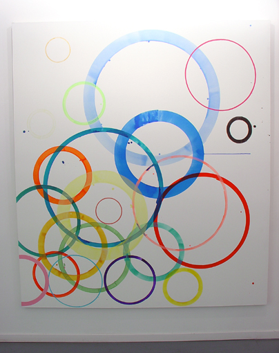
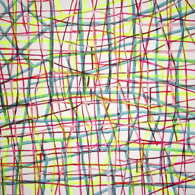
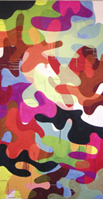
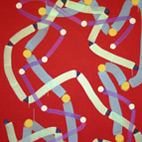
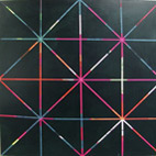
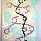
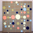
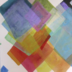
Here is work of Marta, over a number of years, She has always experimented with different colours she tends to use a lot of bright colours to complete work. A lot of her work contains geometric shapes and lines and overlay. Though the art looks completely random it has a sense of order and neatness to designs. I like how there is a wide range created of colour overlay as it gives the colour and different look when over the top of another and the variety of how bold a colour is, whether bold and thick or faintly on the page.
Monday, 3 November 2014
Cleadon Hills Images for Screen Printing


Here are some of the images I had taken, but transformed them in Photoshop, so they were Greyscale and Posterized, as this was so when I created my collage for my screen print, it would work out, After scanning my collage on draft paper, here it is here after I sellotaped the two pages together.


Sunday, 2 November 2014
My Images - Cleadon Hills


Camera was broke, so I had to take photographs on my phone, hasn't got great quality as it could of been. But Images I have taking for my Graphics project of Cleadon Hills.
Subscribe to:
Comments (Atom)